Seatfrog Ticketing | iOS & Android
A bold new vision for the future.
All information in this case study is my own and does not necessarily reflect the views of Seatfrog.
Overview
Seatfrog started life as a product enabling rail passengers to upgrade to First Class for a fraction of the cost. As with most companies, it found a specific niche and capitalised on it, establishing a trusted brand and reputation for providing value.
In 2021, with the pandemic largely behind us and our second product in market (Seatfrog Train Swap), we could now look to the future and begin expanding our offering - starting with tickets. I was part of a small team that redesigned Seatfrog's iOS and Android apps, connecting Tickets, Upgrades and Swaps into the ultimate customer experience.
My Role
Over the course of six months, I lead the Design Team, working closely with a Senior Product Designer, Product Manager and Teach Lead.
Responsibilities included; conducting user interviews, uncovering and distilling insights, building early user flows, sketching wireframes, creating high-fidelity designs, testing prototypes with customers and coordinating the handover process with the development team.
The new version of the Seatfrog App will be released at the beginning of 2022.
Early research and testing on the Railway - Avanti, GWR and South Eastern trains pictured.
Challenges
As an app built specifically around upgrades, it was clear we were going to have to make some structural adjustments so that we could surface the ticketing product in the right place, at the right time (a principle we applied throughout the project). In addition, the app was showing its age and our visual language needed to be updated. This was the perfect opportunity for us to move into Figma and away from the time intensive Sketch, Abstract and Invision workflows we'd been using previously.
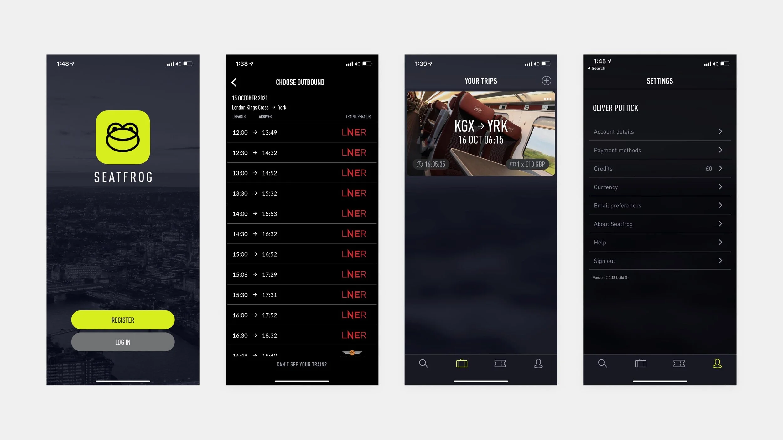
Existing Seatfrog App - From Right to Left: Welcome, Upgrade Search, Trips, Settings
Revised Seatfrog App - From Right to Left: Welcome, Upgrade Search, Auctions, Account
Target Audience
With tickets now in the picture, it was now time to figure out who sat in the centre of our offering. Off-Peak, First Class and Anytime fares would all be available, however, our primary user was the Advance Ticket Holder. We'd built Train Swap for these customers during 2020, and with 70% of our existing customer base all purchasing this fare type for the majority of their travel, it was clear they were going to be our power users.
Early Proto Persona artefacts
Moving forwards by going back
With our expanded offering, users could now begin their experience by planning a journey and purchasing a ticket (before going on to Upgrade or Swap). This was new ground for Seatfrog and to facilitate it, our user flows were completed overhauled. Emphasis would be placed on the initial ticket purchase before guiding customers towards the existing Upgrade and Swap flows.
Seatfrog App - Ticket purchase flow
Unique Value Proposition
Unlike its competitors, Seatfrog is the only platform that allows customers to Upgrade to First Class. This unique advantage was something we were well aware of, and decided to highlight through the ticket purchase flow. Services that had available auctions and first class seats were emphasised, allowing users to make an informed purchase decision.
L: Ticket Search - Star indicates upgrade availability | R: Booking Details - Upgrade Tile
L: Auction Added - Banner | R: Auction Added - Tooltip
A visual update appropriate for 2021
As desperate as we were for something brand new (fluorescent shades of green can be a little polarising), tight deadlines meant that a total overhaul would be out of the question. Instead, we opted to keep the existing colour palette and fonts, combining them into something that felt much more modern to re-skin the entire app.
Before & After: Welcome Screens
Before & After: Permission Modals
Before & After: Home Screens
Before & After: Auction Cards
A scalable design system
Finally, as the entire app would be given a new coat of paint, this was the perfect opportunity for us to move into Figma and away from the time intensive Sketch, Abstract and Invision workflows we'd been using previously. I was tasked with creating a scalable design system, component library and naming conventions that could be applied across both iOS and Android platforms.
Documentation: Colour Styles
Documentation: Text Styles
Documentation: Icons, Spacing Blocks, Gradients, Grids
Figma: Stickersheet - Majority of components built with Auto-layout
Figma: Naming Conventions
Outcome
At the time of writing, the new version of the Seatfrog App is in very late stages of development and will be shortly going out as a Beta. As with most early products, the first version is extremely lean. Many features have been left on the cutting room floor enabling a fast turnaround time, and the opportunity to be in market sooner.
In terms of business impact, well, it's still early days...
What I can say at this point I can say that I'm extremely grateful to have been given an opportunity to rethink how the app looks, feels and works. But also to paint an exciting picture for what the future looks like at Seatfrog. Watch this space!
Thanks for reading this case study!
If you would like to know more about this project, please contact me.


